Moving away from Tailwind, and learning to structure my CSS

**Marcus Webb** — Infrastructure engineer turned tech writer. Writes about AI, DevOps, and security.
**Bottom line:** My recent experiments with ChatGPT 5 and Claude 4.6 for generating complex UI components revealed a critical flaw in utility-first CSS strategies like Tailwind.
AI models consistently produce more brittle, less maintainable, and often inconsistent frontend code when given a pure utility-class approach compared to a well-structured, semantic CSS framework.
This isn't just about code quality; it's about developer velocity and the future of AI-assisted frontend development.
If you’re relying on AI for UI work, your CSS architecture could be a silent bottleneck.
Forget what your bootcamp taught you about Tailwind. I’m serious.
After running hundreds of UI generation prompts through ChatGPT 5 and Claude 4.6 over the last six months, I realized our dependency on utility-first CSS is crippling AI's ability to build truly robust and maintainable frontends.
And honestly, it's costing us developer velocity and introducing subtle, insidious tech debt.
My Tailwind Love Affair, and the AI That Broke It
For years, Tailwind CSS was my go-to. Like many infrastructure engineers who dabble in frontend, the promise of rapid UI development without context switching to a CSS file was irresistible.
I shipped countless dashboards, internal tools, and proof-of-concept UIs with it.
The speed was intoxicating. Adding `flex`, `p-4`, `shadow-lg` felt like assembling LEGOs, and for a long time, it just *worked*.
Then came the AI wave. By mid-2025, LLMs like ChatGPT 5 and Claude 4.6 were generating remarkably coherent React and Vue components.
As an infrastructure guy, I saw the potential for abstracting away even more frontend boilerplate.
My goal was simple: provide a high-level component description, maybe a few data props, and let the AI spit out a production-ready component, complete with styling.
I imagined a world where I could focus entirely on backend APIs and data models, with AI handling the visual layer.
I started feeding my AI co-pilots prompts like, "Generate a responsive user profile card with an avatar, name, title, and three action buttons using React and Tailwind CSS." The initial results were impressive.
It would generate a decent JSX structure, sprinkle in the Tailwind classes, and boom — a profile card.
But as I started pushing for *complexity* and *consistency* across a growing component library, that's where the cracks began to show.
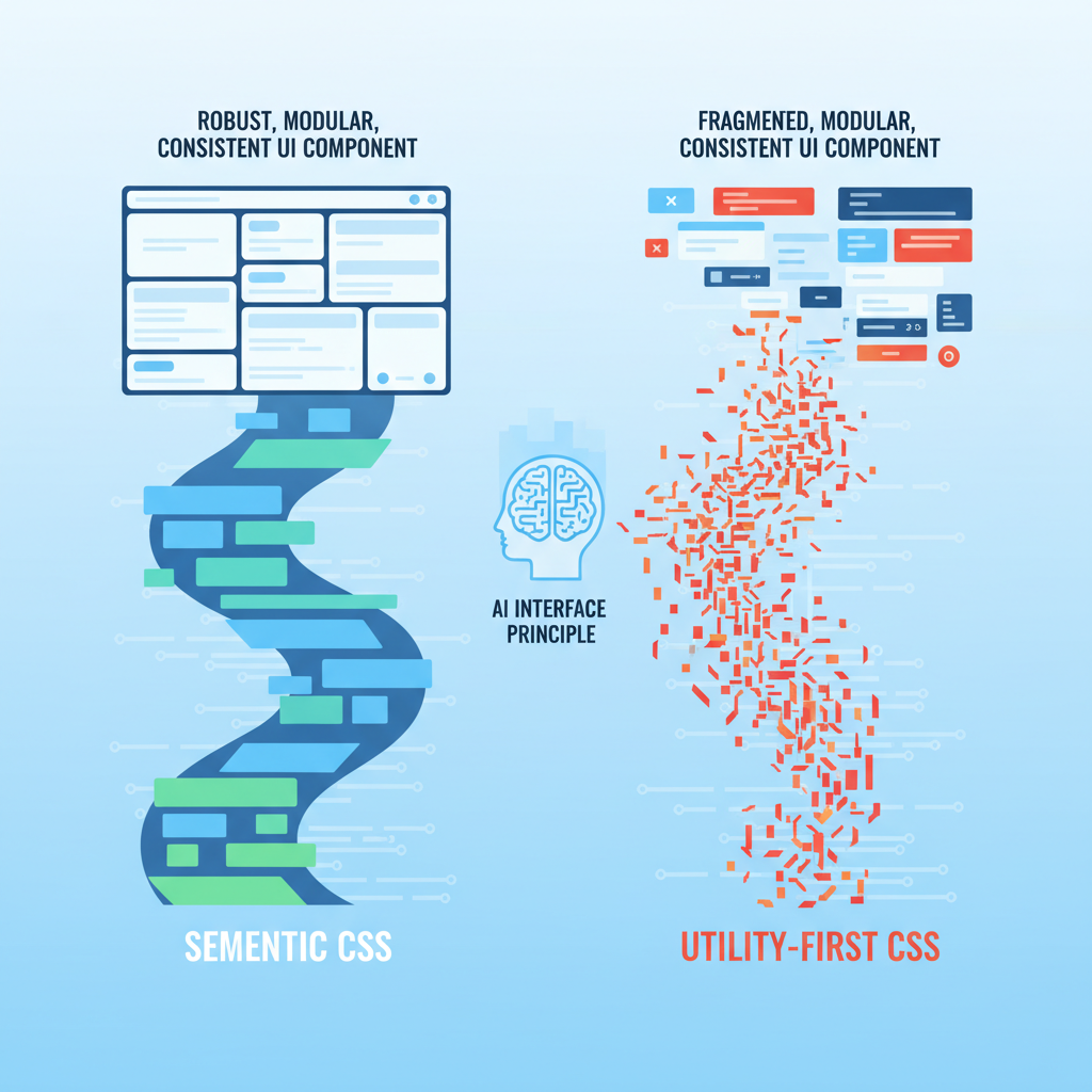
The Semantic AI Interface Principle: Why AI Needs Structure
The core insight hit me like a ton of bricks: AI models, for all their intelligence, are fundamentally pattern-matching engines.
They excel when given clear, consistent patterns and a well-defined grammar. Utility-first CSS, by its very nature, fragments styling into atomic, context-free declarations.
This isn't a problem for a human developer who understands the *intent* behind grouping `flex`, `items-center`, `justify-between` to create a header. But for an AI, it’s a constant re-assembly task.
I call this the **Semantic AI Interface Principle**: For AI to reliably generate and maintain complex systems, it needs interfaces that are not just syntactically correct, but semantically rich and predictable.
#### The Inconsistency Cascade
When I asked ChatGPT 5 to generate a "primary button" and then a "secondary button," it would often use subtly different combinations of `bg-blue-600`, `hover:bg-blue-700`, `px-4`, `py-2` for the primary, and `border`, `border-gray-300`, `text-gray-700`, `px-3`, `py-1.5` for the secondary.
These weren't necessarily *wrong*, but they weren't *consistent*. A human designer would have a design system token for `btn-primary` and `btn-secondary`.
An AI, left to its own devices with just utility classes, reinvents the wheel with every prompt. This led to:
* **Visual drift:** Buttons across the application would look slightly different, even if they were supposed to be the same component.
* **Maintenance hell:** If I wanted to change the primary button's padding, I couldn't just tell the AI, "Update the `btn-primary` class." I had to find every instance where the AI had *simulated* a primary button and hope it applied the changes correctly, or manually edit dozens of utility classes.
* **Prompt engineering overload:** I found myself writing increasingly verbose prompts, trying to dictate every single utility class combination to ensure consistency.
This defeated the purpose of using AI for rapid generation.
#### The Contextual Blind Spot
Tailwind's power comes from its direct mapping of styling to HTML elements. But this directness is also its Achilles' heel when it comes to AI.
When generating a complex component, say, a data table with sortable headers and expandable rows, the AI often struggles with conditional styling or maintaining state-dependent classes.
For example, asking Claude 4.6 to generate a table row that highlights on hover and has an active state class (`is-active`) for the currently selected row often resulted in a messy tangle of conditional logic directly in the JSX, or an over-reliance on `group` classes that felt forced and less readable than a simple semantic class.
When I tried to refactor these components, the AI had a harder time understanding the *intent* behind the utility groupings, making refactoring suggestions less reliable.
It could reorder classes, but it couldn't easily abstract them into a meaningful concept.
The Unexpected Return of Structured CSS
It became clear that for AI to truly be an effective partner in frontend development, it needs a higher level of abstraction.
It needs a vocabulary that describes *what* a UI element *is*, not just *how* it looks. This led me back to structured CSS — but with a modern twist.
I started experimenting with approaches like CSS Modules and a more disciplined BEM (Block-Element-Modifier) naming convention within my React components. The shift was immediate and profound.
#### How AI Thrives on Semantic CSS
1.
**Predictable Generation:** When I defined a `Button.module.css` with classes like `.button`, `.button--primary`, `.button--secondary`, and `.button--large`, the AI (specifically, I found Gemini 2.5 to be surprisingly good at this) could reliably generate JSX that imported these modules and applied the correct classes.
The output was cleaner, more consistent, and required far less manual correction.
2. **Easier Refactoring:** Changing the styling of a primary button became a simple matter of modifying the `.button--primary` rule in the CSS module.
The AI could then infer that any component using `className={styles.buttonPrimary}` would reflect this change. This drastically reduced the maintenance burden.
3. **Component-Level Reasoning:** AI models could better understand the *relationship* between components and their styles.
Instead of seeing a jumble of utility classes on a `div`, it saw a `Card` component with a `card__header` and `card__body`.
This semantic understanding allowed it to generate more robust and extensible components. It could even generate new components *in the style of existing ones* with higher fidelity.
This isn't to say I abandoned all utility classes. I still found them useful for one-off adjustments or very specific layout concerns. But the *default* became semantic, component-scoped CSS.
This hybrid approach gave the AI the structure it needed while retaining some of the flexibility I valued.
The Reality Check: Hype vs. Practicality
Let's be clear: Tailwind is an excellent tool for specific use cases, especially for rapid prototyping or teams with strong design systems that enforce strict utility class usage.
Its strength lies in its directness and developer experience.
However, the hype that AI can simply "handle" any styling paradigm is breaking down.
The idea that you can just prompt an AI to build a complex application with a utility-first framework and expect a maintainable, consistent codebase is a mirage.
AI today is a powerful assistant, not an autonomous architect for complex, evolving UIs. It needs guardrails, and those guardrails often come in the form of well-defined structure and semantics.

The problem isn't the AI's intelligence; it's the lack of semantic information in utility-first CSS for it to reason about at a higher level.
We're asking it to be a master chef with only individual ingredients, never a pre-mixed sauce.
The Practical Takeaway: Reclaim Your CSS Architecture
So, what should developers and professionals actually do?
1. **Prioritize Semantic Structure:** When building new components, or even refactoring existing ones, think about the *meaning* of your UI elements.
Use CSS Modules, BEM, or even Styled Components to create a clear, component-scoped styling system.
2.
**Define Your Design System Explicitly:** If you're using a utility-first framework, create a clear mapping of utility class combinations to named design tokens (e.g., `btn-primary = px-4 py-2 bg-blue-600 text-white`).
This gives your AI a "dictionary" to reference, reducing inconsistency.
3. **Teach Your AI:** When prompting AI for UI generation, include examples of your structured CSS or component library. Show it *how* you build, don't just tell it *what* to build.
Reference your `Button.module.css` or your BEM-structured `card.css`.
4. **Embrace Hybrid Approaches:** There's no single "right" answer. Use utilities where they make sense for quick layouts or minor adjustments.
But for core components and shared UI elements, lean into semantic, structured CSS.
5. **Think Long-Term Maintainability:** Before AI, a human could eventually untangle a complex utility-class mess.
With AI, the tech debt generated by inconsistent utility usage can quickly spiral out of control, making future AI-assisted refactoring even harder.
The future of frontend development will undoubtedly involve AI.
But for AI to truly augment our abilities, we need to design our systems in a way that AI can understand, learn from, and reliably extend.
For me, that meant moving away from the pure utility-first paradigm and rediscovering the power of well-structured CSS.
It was an unexpected journey, but one that has fundamentally changed how I approach frontend development with AI.
Have you noticed your AI-generated UIs becoming brittle or inconsistent, or is it just me? Let's talk in the comments about how you're structuring your CSS for the AI era.
---