USB Colors have meanings?
Bottom line: The viral YouTube trend claiming USB cable and port colors have standardized meanings is largely a myth, leading to common performance and compatibility issues for developers and users.
While some manufacturers adopt conventional colors like blue for USB 3.0 or red for enhanced charging, these are vendor-specific choices, not official USB-IF specifications for speed or power delivery.
Relying on color alone is a costly mistake; true indicators are the official USB-IF logos, specific port labels (e.g., "SS 10"), and the underlying USB standard version (e.g., USB 3.2 Gen 2x2, USB4).
Misunderstanding these can lead to purchasing incorrect hardware, debugging slow data transfers, and unexpected power delivery failures in systems designed today, in mid-2026.
I spent years, probably too many years, trusting the colors. Blue meant fast, red meant power, yellow meant always-on charging. It was a simple, intuitive system.
Until it wasn't. I've watched countless developers, even experienced ones, fall into the same trap, believing a cheap cable with a blue tip would deliver the promised USB 3.0 speeds.
Spoiler: it often doesn't. And the cost of that misunderstanding, in lost productivity and wasted hardware, is far more significant than those viral videos would have you believe.
This isn't just about a cable; it's about the fundamental misunderstanding of technical standards that plagues our industry.
We crave simple visual cues, especially when the underlying technology is complex. But when those cues are misleading, they create a cascade of problems, from slow backups to failed device deployments.
Why The USB Color Myth Persists (And Why It Matters Now)
It’s June 2026, and the internet is still awash with videos and articles claiming that USB port and cable colors are a universal language.
You’ve seen them: "Blue is USB 3.0!", "Red is Fast Charging!", "Yellow is Always-On Power!" The allure is undeniable.
In a world of ever-increasing USB standards—from the original USB 1.0 to USB 3.2 Gen 2x2 and the burgeoning USB4 specification—the idea of a simple, color-coded system to navigate this complexity is incredibly appealing.
It’s a shortcut, a mental hack that promises to simplify hardware selection and troubleshooting.
But here’s the rub: these color conventions are largely unofficial, inconsistent, and often flat-out wrong.
The USB Implementers Forum (USB-IF), the body that defines the USB standard, does not mandate specific colors for speed or power delivery.
While certain manufacturers have adopted these conventions (blue for SuperSpeed USB, red/yellow for high-power ports), it’s a voluntary choice, not a universal rule. And that distinction is critical.
The problem isn't just academic. I've personally seen engineering teams debug performance issues for days, only to discover a "blue" cable was actually a USB 2.0 cable with a blue plastic insert.
I've watched users buy "red" charging cables, expecting rapid power delivery, only to find their devices trickle-charging.
In a world where every millisecond counts, and power delivery can literally make or break a product, relying on arbitrary colors is a recipe for disaster.
This isn't just about a YouTube trend; it’s about the tangible impact of misinformation on our daily work and the hardware we build and use.
The Contrarian Reframe: Your USB Cable Colors Are Lying To You
Let me be direct: anyone telling you that USB colors are a universally standardized indicator of speed or power is either misinformed or oversimplifying to the point of falsehood.
The widespread belief that blue means USB 3.0 (or newer SuperSpeed), red/yellow means high-power charging, and black/white means older USB 2.0/1.x is a dangerous oversimplification.
It’s a convenient fiction that has evolved through common manufacturer practices, but it lacks the critical backing of the official USB specification.
Think about it. If colors were the official standard, why would the USB-IF invest so heavily in specific logos, naming conventions like "SuperSpeed USB 10Gbps," and precise physical connector designs?
They wouldn't.
The very existence of these detailed, often confusing, branding guidelines is a testament to the fact that something as arbitrary and prone to manufacturing variation as color simply isn't robust enough for a global standard.
The mainstream take on USB colors is fundamentally flawed because it prioritizes visual intuition over documented specification.
It assumes that because some manufacturers choose to use blue for their SuperSpeed USB ports, that choice translates into a universal mandate. It doesn't.
This is akin to assuming all cars with red paint are sports cars. While many might be, the paint color itself isn't the defining characteristic of performance.
The engine, the suspension, the chassis — those are the specs that matter.

With USB, the "engine" is the underlying standard, the physical connector type, and the official logos, not the color of the plastic.
This distinction is vital for anyone who actually needs their tech to work as advertised.
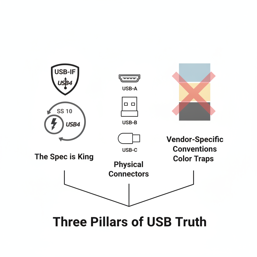
The Three Pillars of USB Truth: What Actually Matters
To truly understand your USB connections, you need to discard the color myths and embrace the actual, documented standards.
I've boiled it down to what I call "The Three Pillars of USB Truth." Master these, and you'll never be fooled by a pretty blue port again.
#### 1. The Spec is King: Logos, Naming, and the USB-IF
This is the absolute bedrock. The USB Implementers Forum (USB-IF) defines the entire standard, from electrical characteristics to naming conventions and required logos.
These logos are your most reliable indicator of a port or cable's capabilities.
- USB 2.0 (Hi-Speed): Often depicted with a trident-like symbol. Max theoretical speed: 480 Mbps.
- USB 3.2 Gen 1 (SuperSpeed USB): Previously known as USB 3.0 or 3.1 Gen 1. The logo is a stylized "SS" (SuperSpeed). Max theoretical speed: 5 Gbps.
- USB 3.2 Gen 2 (SuperSpeed USB 10Gbps): Previously USB 3.1 Gen 2. The logo is "SS" with a "10" next to it. Max theoretical speed: 10 Gbps.
- USB 3.2 Gen 2x2 (SuperSpeed USB 20Gbps): The logo is "SS" with a "20" next to it. Max theoretical speed: 20 Gbps. This requires a USB-C connector.
- USB4 (USB4 20Gbps, USB4 40Gbps): This is where things get really interesting. USB4 leverages the underlying Thunderbolt 3/4 protocol. It only uses USB-C connectors.
The logo usually features a "4" with a stylized lightning bolt. Max theoretical speed: 20 Gbps or 40 Gbps, depending on implementation.
Key takeaway: Always look for these logos printed on the port itself, near the port, or on the cable connector.
If they're absent, especially on a cable, assume the lowest common denominator or exercise extreme caution.
#### 2. Physical Connectors: The Shape of Potential (USB-A, B, C)
The physical shape of the connector dictates potential and compatibility, but not necessarily the actual speed or power.
- USB-A: The classic rectangular port. Can support any USB version up to USB 3.2 Gen 2. If it's blue, it might be SuperSpeed, but it's not guaranteed. If it's black or white, it's almost certainly USB 2.0 or older.
- USB-B: The square, printer-style connector. Less common now, but still around.
- Micro-USB / Mini-USB: Smaller versions, typically associated with older mobile devices and USB 2.0. Micro-USB 3.0 exists (with an extra bump), but it's less common.
- USB-C: The reversible, oval-shaped connector. This is the future. USB-C can support USB 3.2 Gen 2x2, USB4, Thunderbolt 3/4, DisplayPort Alt Mode, and USB Power Delivery (up to 240W with USB PD 3.1).
However, a USB-C cable or port does not automatically mean it supports these advanced features. A cheap USB-C cable might only carry USB 2.0 data and limited power.
Again, look for logos (SS 10, SS 20, USB4, Thunderbolt) next to the port or on the cable.
Key takeaway: USB-C is versatile, but its physical form factor doesn't guarantee advanced features. It's just the vessel.
The actual capabilities are defined by the standard running over the USB-C connection, indicated by logos and specs.
#### 3. Vendor-Specific Conventions: The "Color Traps"
This is where the confusion truly stems from. Many manufacturers, in an effort to provide some visual differentiation, have adopted color schemes.
- Blue: Widely used by many PC manufacturers for USB 3.0/3.2 Gen 1 (5Gbps) ports. This is the most consistent "color rule," but still not official.
- Red/Orange/Yellow: Often used for high-power (e.g., 5V/1.5A or more) or "always-on" charging ports. These ports typically provide power even when the computer is off, useful for charging phones. This is entirely at the manufacturer's discretion. Some gaming motherboards use red for aesthetic reasons, but the port might only be USB 2.0.
- Teal/Green: Less common, but sometimes seen for USB 3.2 Gen 2 (10Gbps) ports, especially on motherboards.
- White/Black: Almost universally indicates older USB 1.x or USB 2.0 ports. This is perhaps the most reliable color indicator, but it’s still a convention, not a standard.
Key takeaway: These color choices are helpful hints if you're dealing with a familiar brand, but they are not guarantees. Never rely solely on color for critical applications.
Always refer back to Pillar 1 and 2.
Real-World Implications: Don't Get Burned By Bad USB
Understanding the true nature of USB standards, and discarding the color myths, has profound implications for anyone working with technology in mid-2026.
#### For Developers and Engineers
If you’re a mid-level backend engineer or embedded systems developer, this directly impacts your work.
You're specifying hardware for a new product, selecting cables for a test rig, or debugging a performance bottleneck. Relying on a blue port to guarantee 5Gbps can lead to:
- Debugging nightmares: Spending days tracking down why your data transfer is slow, only to find the "SuperSpeed" cable you bought based on its blue tip is actually a cheap USB 2.0 cable with colored plastic. This is a real cost in developer time.
- Incorrect Bill of Materials (BOM): Specifying a component based on a color convention can lead to ordering the wrong parts, causing project delays and budget overruns.
- Power delivery failures: Designing a system that expects a certain power output from a "red" port, only to find the vendor implemented a standard 5V/0.5A port, can brick devices or prevent proper operation.
- Certification headaches: If your product needs to pass USB-IF compliance, assuming color means capability will get you laughed out of the room. The official specs are what matter.
In the next 12 months, as USB4 becomes even more prevalent and USB PD 3.1 pushes power delivery to 240W, a casual approach to USB specifications will be even more punishing.
Your career depends on understanding the true capabilities of the hardware you interact with.
#### For IT Professionals and Tech Enthusiasts
For anyone managing hardware fleets, setting up workstations, or simply trying to get the most out of their personal tech, this knowledge is power.
- Smart purchasing decisions: Stop buying cables based on color. Look for official USB-IF logos, read the product descriptions for specific speeds (e.g., "USB 3.2 Gen 2x2, 20Gbps"), and ensure the cable supports the power delivery you need (e.g., "USB Power Delivery 100W"). A slightly more expensive, properly spec'd cable saves you headaches and delivers on its promise.
- Troubleshooting efficiency: When a device isn't performing as expected, don't just blame the software. Verify your physical connections. Check the actual USB standard of the port and cable, not just its color. This simple step can save hours of fruitless debugging.
- Future-proofing: As we head into 2027, with more devices leveraging USB4 and higher power delivery, understanding the actual specs of your hardware ensures you're ready for the next generation of peripherals and faster workflows. Don't let a misleading color force you into early upgrades or compromise your setup.
The Bigger Picture: Beyond the Surface
The USB color myth is a microcosm of a larger challenge in our increasingly complex technological landscape. We are constantly seeking shortcuts, simple heuristics to navigate oceans of information.
And while these shortcuts can be helpful, they become dangerous when they deviate from the underlying truth.
In an era of AI-generated content and viral misinformation, critical thinking about technical standards is more important than ever.
Don’t trust a pretty color when the official specification is available. Don't assume a YouTube video is definitive when the USB-IF has published comprehensive documentation.
As builders and users of technology, our responsibility is to dig deeper, to understand the "why" behind the "what," and to prioritize factual accuracy over convenient fictions.
So, the next time you plug in a USB cable, ignore the color. Look for the logos. Read the spec. Your productivity, your projects, and your sanity will thank you.
Have you ever been burned by a USB color myth, or is there another widely-believed tech "shortcut" that you know is actually misleading? Let's talk in the comments.