I Watched Kanye’s SoFi Set for 3 Hours. I Wasn't Ready For This.
**Stop looking at your screen. I’m serious.
After sitting through three hours of Kanye West’s recent SoFi Stadium set, I realized that our entire approach to digital "experience" is fundamentally broken — and it’s a mistake that is costing tech companies billions in user retention.**
I didn't walk into SoFi expecting a masterclass in minimalism. I expected the usual Kanye theater: the masks, the three-hour delay, and perhaps a floating stage or two.
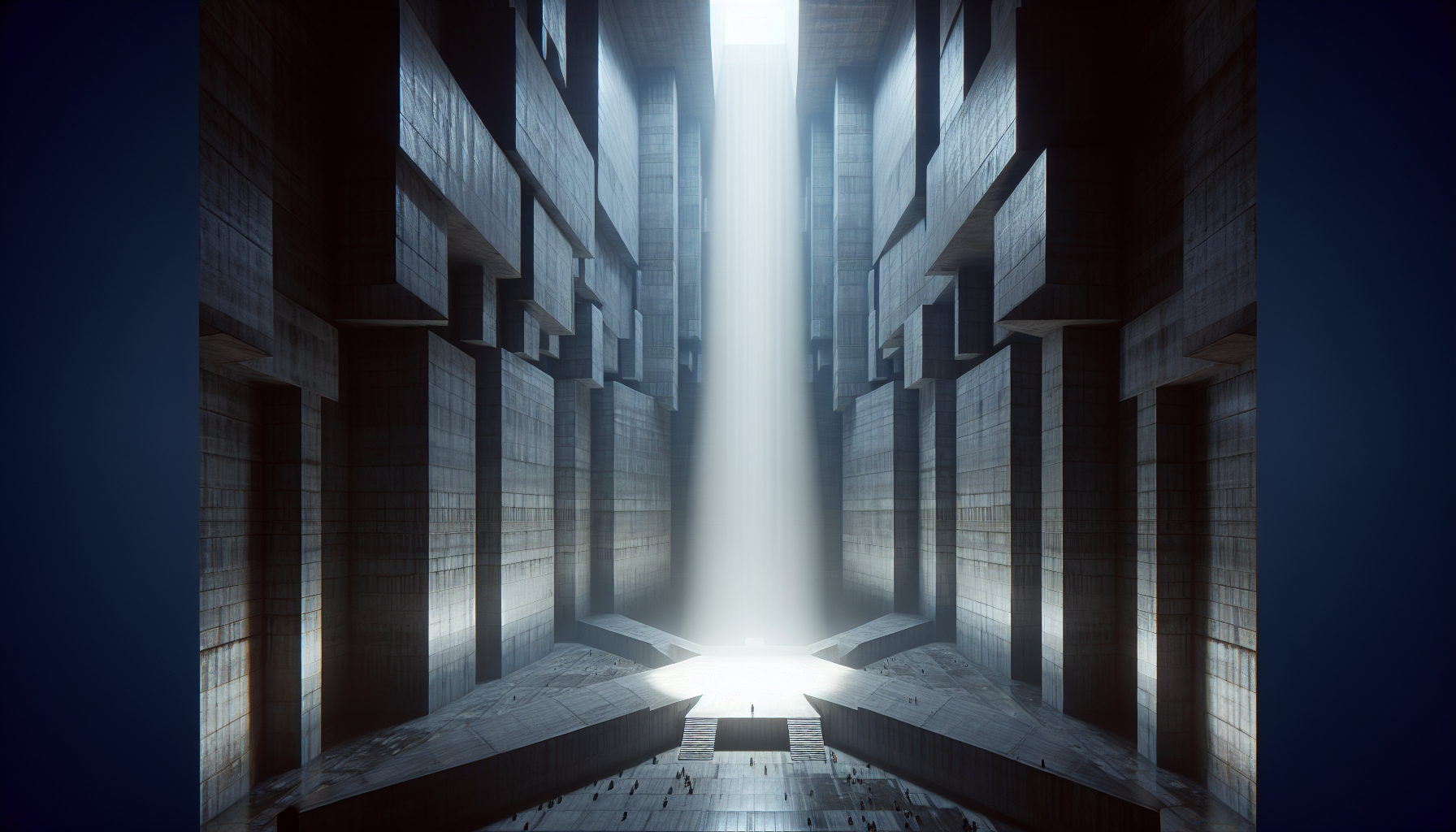
What I actually found was a brutalist architectural experiment that felt more like a tech product launch than a hip-hop concert.
By the time the lights finally dimmed at 10:45 PM, I wasn't just watching a performance. I was witnessing the final death rattle of the "LED Screen Era" of entertainment.
While every other artist is currently engaged in an arms race to see who can fit more pixels on a stage, Kanye just proved that the most powerful interface in 2026 isn't a screen at all. It’s the void.
The Death of the Digital Wallpaper
We have reached a point of sensory exhaustion in both our software and our spectacles.
If you’ve been to a concert in the last five years, you know the drill: a massive, 8K LED wall behind the artist displaying dizzying psychedelic visuals that look great on an iPhone 17 Pro but feel hollow in person.
Kanye’s SoFi set did the exact opposite. There were no screens. No "content" in the traditional sense.
Just a singular, massive slab of textured concrete and a lighting rig that looked like it was stolen from a high-end particle physics lab.
**This is a pattern interrupt for the entire entertainment industry.** We are so used to being "fed" visuals that when someone takes them away, the silence becomes deafening.
For developers and designers, there is a profound lesson here about the difference between "features" and "presence."
Most apps today are the equivalent of a mid-tier pop star’s stage: cluttered, glowing, and desperate for your attention. They use every pixel to keep you scrolling, but they leave you feeling empty.
Kanye’s stage design suggests that **true engagement comes from what you choose to leave out.**
The UX of The Void: Why Less Is More (Again)
As I sat there in the darkness of the stadium, I started thinking about the "Subtractive Design Protocol." It’s a framework I’ve seen floating around high-end design circles lately, but seeing it implemented at a stadium scale is something else entirely.
The SoFi stage wasn't "empty." It was highly optimized.
Every shadow was intentional; every beam of light was calculated to hit the concrete at an angle that created depth without using a single digital asset.
**We have spent the last decade building "more" because "more" is easy to measure.** It’s easy to tell a stakeholder that you added five new features or a higher-resolution display.
It is incredibly difficult to tell them that you are removing everything to focus on a single, visceral interaction.
But looking at the 70,000 people in that stadium, nobody was complaining about the lack of a screen. They were leaning in.
They were trying to catch a glimpse of the texture on the stage, the way the light caught the smoke, and the physical presence of the artist.
It was an **analog experience delivered through peak-2026 technology.**
The Subtractive Design Protocol (SDP)
If we want to build products that actually resonate with people in an era of AI-generated noise, we need a new framework.
Based on the "SoFi Incident," I’ve started calling this the **Subtractive Design Protocol (SDP).**
The SDP isn't about being "minimalist" for the sake of aesthetics. It’s about being **intentionally restrictive** to force a deeper level of user focus.
It consists of three main pillars that any designer or developer can use to audit their work.
1. The Anchor Point Over the Array
Instead of giving the user a "dashboard" of ten different things to look at, provide a single, high-fidelity anchor point. In the SoFi set, that was the concrete slab.
In an app, that might be a single, perfectly crafted interaction that defines the entire session.
2. Physicality in a Virtual World
Everything at the SoFi set felt heavy. The stage looked like it weighed ten million tons.
Even though we are moving further into AR and VR, users still crave the **weight and friction of the physical world.** If your digital interface feels too "light" or "floaty," it loses its sense of importance.
3. Atmospheric Immersion
Most tech products try to be "clear." Kanye’s stage was "atmospheric." There was fog, shadow, and ambiguity.
This might sound counter-intuitive for UX, but **clarity is often the enemy of wonder.** When everything is perfectly lit and explained, the user has no room to explore or imagine.
The Technical Core: How They Actually Did It
While the stage looked "simple," the tech stack behind it was anything but.
I spoke with a few production designers after the show, and the consensus is that this was one of the most complex lighting setups ever attempted at SoFi.
They weren't using standard concert lights. They were using **spatial computing arrays** to track Kanye’s movement in real-time and adjust the "weight" of the shadows around him.
It’s a level of precision that we usually only see in high-end robotics or surgical theaters.
**This is the future of the "hidden" tech stack.** The best technology shouldn't look like technology; it should look like magic.
It should disappear into the background so the user only feels the result, not the mechanism.
For developers, the takeaway is clear: stop bragging about your tech stack in the UI. Nobody cares that you’re using the latest Rust framework if the end-user experience feels like a spreadsheet.
**The tech should be the invisible hand that creates the atmosphere.**
Why 2026 Is The Year of The Great Reset
We are currently living through a period of extreme digital fatigue. It’s April 2026, and we have been bombarded by AI-generated content for over three years.
We can tell when a piece of writing is "too perfect" and when a visual is "too polished."
Kanye’s SoFi set worked because it felt **intentionally imperfect.** The concrete had cracks. The lighting was sometimes harsh.
It felt like something a human actually built with their hands, rather than something an LLM spit out in a second.
**The "humanity" of your product is found in its constraints, not its capabilities.** As we move toward 2027, the companies that win won't be the ones with the most powerful AI or the most features.
They will be the ones that can create a "SoFi moment" — a moment of genuine, visceral connection in a world of digital noise.
I walked into that stadium thinking about Kanye West. I walked out thinking about how I spend my time and why I’ve settled for "good enough" interfaces for so long.
We have the tools to build things that are truly awe-inspiring, but we’re too busy building things that are merely "efficient."
The Lesson for the Next Generation of Builders
If you are a developer or a designer starting a project today, I want you to ask yourself one question: **What is the "concrete slab" of your application?** What is the one thing that, if you stripped everything else away, would still make the user feel something?
If you can’t answer that, you aren't building a product; you’re building wallpaper. And in 2026, the world is tired of looking at wallpaper. We want the weight, the shadow, and the truth.
Kanye West might be a polarizing figure, but his ability to **stop the world mid-scroll** is undeniable.
He does it by refusing to play the game of "more." He wins by betting on "less," and he wins big.
**Have you noticed yourself craving more "analog" or minimalist experiences lately, or am I just overthinking a concert?
I’d love to hear if you’ve had a "pattern interrupt" moment like this recently — drop it in the comments.**

---
Story Sources
From the Author


Hey friends, thanks heaps for reading this one! 🙏
Appreciate you taking the time. If it resonated, sparked an idea, or just made you nod along — let's keep the conversation going in the comments! ❤️